Thursday 27 May 2010

3 Terms, 4 Design Assignments, 100 collages, 2 essays, 1 portfolio, and a whole lot of workshops…

I really have learnt too much to summarise in a few lines here, so I thought the logical thing to do was to look at each assignment we've completed over the past 8 months and outline the key things I've taken away from each experience…:


This year I have learnt that:


GDF:


- Your first idea is not always your best idea


- I really enjoy working with a sketchbook to clarify and develop my ideas

- Your work is so much more successful if it comes from the research, rather than the other way round

- A graphic design assignment is not so different from writing an essay as I first assumed; both require a thorough amount of research and analysis, to argue the case for a particular outcome

- Two (or three or four…) heads really are better than one when it comes to idea generation

- There is a difference between having conviction in a strong design concept and being precious about it

- Criticism is a GREAT thing! Even if you completely disagree it gives you an insight into how others perceive your work…

- Ideas don't come from a computer

- If 'work' doesn't feel like work, then you're onto a winner!


100 Collages:


- I have a preoccupation with nudity and sex that I was aware of, and a preoccupation with religion, that I wasn't.


GDA: Book Project:


- It's easier tone down an extreme design concept than it is to make a dull design exciting…


- I missed using a sketchbook


- Leaving it until the day before a deadline to check technical/website issues is NOT a good idea


- The gutter is not a good place for crucial (visual) information


- To an extent, it's important to bring a degree of personality to your work, while still fulfilling the needs of the client and the brief.


GDA: Poster Project.


- I was relieved to be reunited with a sketchbook.


- If you can't justify a design decision, you need to really question it's validity: Instinct is a vital ingredient but it is not enough on its own.


- VISUAL ECONOMY IS KEY: For poster design you have such little time to convey your message, that if it's not conveying the message it's too much information.


- If you can't sum up your message in one or two sentences, you either don't know what your message is, or it's too complicated.


- Sometimes your first idea IS your best idea, but you only know that because you've tried everything else…


- The disparity between privileged and deprived around the world is MASSIVE and ultimately simply a result of circumstance: If you can use your skills as a graphic communicator to raise awareness of this disparity YOU SHOULD!


- Print is my passion.


Major Project:


- Sometimes too much planning stifles creativity and your work is more interesting if you don't start out with a destination in mind.


- Sketchbooks smaller than A4 are too small


- If you have multiple projects on the go simultaneously you need to be ORGANISED!


VCT:


- Modernism and early graphic design was reacting against a set of accepted aesthetic principles, and it's not until you know what those principles are that you really understand the rationale behind the success of the work of Modern typographers and designers.


- Sometimes typography needs to be the crystal goblet and sometimes it needs to be more expressive.


PPD:


- Keeping a blog requires discipline!


- A portfolio does not need to be a blow by blow archive of every piece of design you've ever created.


- My true passion lies in print and identity design, and that, although it is a good idea to be familiar with digital developments and software, there will always be a need and a place for well-designed print.


A(n academic) year on, and it really is satisfying to feel like I'm moving forward and improving as a designer. Some of the key things I will take from this year are a conscious scrutiny and justification of my design decisions, staying away from a computer for as long as possible when developing design concepts and visual economy...


Roll on Year 2!

LondonPATTERN


The pattern workshop involved taking a found London graphic and experimenting with repetition and colour to create a pattern that captured the essence of the capital. During the workshop I travelled to London Bridge and picked up a typical London postcard, complete with images of Eros, Bowler hats and the London Underground roundel. I set myself the challenge of trying to transform the Underground roundel from something cliched and obvious to something a little more crafted and intriguing.


During the course of the workshop I altered the form of the roundel to make it a little more abstract and bold and then experimented with repetition and rotation to create the pattern.


I opted to use yellow instead of the ubiquitous London red, partly to reference the safety message on the tube and partly to capture the electric excitement of the capital…As previously stated I now intend to create a series of these patterns to incorporate into my CONTRASTLondon chapter...

LondonLEGENDS


The Urban Legends workshop required us to storyboard one of a list of Urban Legends relating to London, and then distill this storyboard into a sequence of 3 images which successfully conveyed the narrative.


I opted for a Victorian setting for my narrative, informed by the story's references to dark alleys, mutilated bodies and mysterious letters.


During the workshop I decided to experiment with extreme angle of view, which gave the storyboard a filmic quality. From this I decided to try and create a graphic narrative which merged the crime-noir comicbook style of artists such as Frank Lee with Victorian engravings.


I researched the Victorian Penny Dreadful illustrations, along with crime-noir comics, and a practical guide on drawing the style. It became clear the natural narrator for the sequence was the policeman, and so I set about trying to marry the two styles, initially attempting to create a dark troubled hero from the rather staid figure of the Victorian policeman.


I am now currently revisiting the storyboard and reworking it from the new protagonist's point of view...

CARDBOARDLondon


My outcome from the 3D construction was one of the towers from the iconic Battersea Power Station. Although it had potential for a detailed scale model of the landmark, it didn't immediately grab me and so I set about exploring other possibilities for a 3D outcome, finally finding inspiration in the pop-up work of David A. Carter, which I realised could provide an interesting spread in my final book.


I began by emulating some of Carter's pieces, roughly reworking them with iconic London imagery, and experimenting with how to make the popup work effectively.


I now need to continue to develop this concept into a spread I can include in my book...I had been sitting on this one for a while, however a music video caught my eye in the gym yesterday which has really inspired me to get back on developing this idea - its a video for singer Lisa Hannigan's song 'Lille' and is beautiful!


LondonTOURIST


For the Souvenir workshop we each brought in a cheap, tacky souvenir and then over the course of the workshop, scrutinised them using the '5 W's and an H' technique to discern who might buy them, where they might be sold, why they exist, etc. From these questions we made a list of our dominant ideas about the various aspects of the souvenirs. We then used these ideas and thoughts to carry out a concept challenge to try and generate some original ideas for alternative souvenirs.

A couple of ideas which came out of our concept challenge and stepping stone was dolls of real British people, like old ladies, chavs, etc, which would be more representative of life in Britain, and/or a really well-crafted souvenir...


This got me thinking about the work of Andrew Tanner and so after the workshop I researched his 'Souvenirs Worth Giving'/Designed in England project.


It struck me that ceramic goods perfectly capture Britain's heritage and craft history. As such I began formulating ideas for a tea set which depicts modern Britons, and scenes from modern British life, such as drinking/clubbing, etc...

As yet I haven't set aside any more time to create the visuals for this, but will photoshop aseries of mockups teacups for my chapter....

CAMOUFLAGELondon

By way of preparation for the camouflage workshop, I visited two contrasting areas, St James Park and Shaftesbury avenue, and made a note of the common patterns, textures, objects, etc.


St James Park: Needless to say, the predominant patterns and textures in the park were organic natural patterns, including dappled leafy sunlight, woodgrains, etc. However this natural landscape was also interrupted by the straight lines and grids of the man-made landscape in, eg, the benches, fences, deckchairs, etc. Again, unsurprisingly, the colour palette of the park is predominated by natural hues of greens, blues, and browns.


Shaftesbury Avenue. One of the recurring visual themes of Shaftesbury Avenue is repeating circles, as seen in the theatre marquees, pelican crossing paving slabs, decorations along the street and even in the rubbish (above). In addition the primary textures/patterns are those of decaying brown brickwork and neon-tube signage which is common to the street. These textures combined with the shop-fronts of the Chinatown stores creates a bold, striking colour palette of red, black and brown.


In the workshop I began experimenting with lines of red and black dots cut using a hole-punch. While I could have created this effect quickly and easily using a computer, I wanted to experiment with a less polished, more crafted feel. I plan to develop this pattern by taking a rubbing of brickwork and then digitised both this and the paper circles, and experiment with overlaying and repeating the patterns and textures. I will use these patterns in conjunction with the CONTRASTLondon and LondonPATTERN workshops to create my Junzo Terado-inspired graphics...


Wednesday 26 May 2010

MAPLondon


Using both contemporary and historical sources as starting points, in the workshop we explored the possibilities of the map as a graphic medium. Inspired by Grayson Perry's use of a Renaissance visual framework to figure modern-day experiences, I experimented with using Medieval iconography to represent my own idiosyncratic encounters London.


While I found the juxtaposition between historic and contemporary in these experiments interesting, I felt there was more to be exploited in the medium of the map and so visited the 'Magnificent Maps' exhibition at the British Library. This provided me with a number of ideas/concepts to explore further, including:

  • A 'map' need not necessarily tell the truth or be geographically accurate
  • Rotating text labels through 180 degrees results in a map that is technically accurate, yet strangely disorientating (see Descelier's 1550 World Map)
  • London as a literal island (see Stephen Walter's The Island)
  • Map as encyclopaedia - featuring prominent social/political figures/events


From these ideas I decided to experiment with a hybrid of Grayson Perry and Stephen Walter, that is, a map that presents London as an actual island but using the visual landscape of the Medieval and Renaissance maps. Further, I then considered the literary trope of the island as an area for subversion of social/political structures (eg, The Tempest, Lord of the Flies, The Beach, etc), and so decided to invert my island such that it was still recognisable as London, but in a disorientating guise.


Following on from this I explored the idea of power and display through the map, experimenting with the presentation of iconic misbehaving Londoners such as Amy Winehouse, Russell Brand, Kate Moss, etc, as peerless royalty and London's true political/financial power figures, eg, David Cameron, Alan Sugar, the Queene as Renaissance monsters, demons, etc. Edmund Spenser's epic Poem The Faerie Queene seemed the perfect source for characters and descriptions due to its own highly allegorical form and historical literary style.


Having planned the style and content of my map of the Isle of London, I just need to work it up as a final outcome!


LondonTYPE


My focus in the Vernacular Type workshop was experimenting with found native typefaces to create vernacular hybrid letterforms.


Although some of these showed promise, after developing the 'spires' type graphic from the stencil workshop, I realised this might make a visually arresting complete typeface, and so opted to pursued this further...


I have since been gathering a variety of source typefaces which might work well with the spires annexed, and the next step is to experiment which works best stylistically and aesthetically...


Instead of the ambigram form of the typeface I used for the outcome from the Stencil workshop, I will experiment using the uppercase alphabet for the 'spires' font family and the lowercase as the 'inverted spires/dripping blood' font family...

TYPELondon


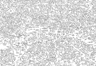
In this workshop we created a map of a small section of London using type, which was then stitched together to create a 'Type-map' of a relatively large area of London:


I found this use of type interesting an inspiring, and began to look further into typographic maps and landscapes.


I then thought about the concept of the typographic portrait, that is, using type as a means of mapping out a face, as used by studios such as Stephan Sagmeister and Music.


I began to explore how I could use the human face and type as a means of mapping the essence of London.


Whilst I initially began experimenting with mapping political manifestos onto the faces of David Cameron, Gordon Brown and Nick Clegg, I decided against this approach for a couple of reasons:


a) I found an existing example of the 3 leaders' faces mapped out in type taken from their manifestos


b) I questioned how much the faces of the 'Big 3' really summed up and captured the essence of the streets of London.


In my monoprint development work I had decided to photograph a number of London's homeless, and it dawned on me that these people would be the perfect way of figuring a map of London - people who were almost synonymous with the streets themselves.


As I mentioned in my development work for Monoprint, I was inspired by the work of B&W studio and their use of stark, direct photographic portraits and hard-hitting, honest real-life stories. I decided to experiment with combining the portrait with the story and so as I photographed the homeless people I met I also interviewed them and discovered their backgrounds, eg, Brian:


"I live in Victoria, been there about..er..16 years? selling the Big issue on and off. I became homeless just because of a bad divorce and mental breakdown I 'spose. I was living with my wife and then it all went pear-shaped; started drinking too much and things just fell apart from there. I was working at the time and I lost my job because of the drinking, lost my flat, 'cause I couldn't keep up with the rent, and my flatmates couldn't put up with all the mood swings and that so I got chucked out of there and ended up roughing it on the street. My plan for the future is to get off the street - I'm waiting for somewhere now at the moment and as soon as that comes up I should be on the move - get somewhere to live and then get a job. That's the dream."


I then took the most pertinent aspects of the story and have begun to experimenting using it in type form to paint Brian's portrait...


Obviously, it needs refinement but I'm happy with the way these type portraits are developing and ideally would like to produce 2 or 3 for my book.