Wednesday 2 December 2009

Co-operate or Die

I LOVE this A6 brochure for printing company Calverts. It’s a really accomplished and attractive piece of design that successfully marries vintage imagery and typography with a good old British sense of wit and some contemporary (green) printing methods;

For me, it successfully portrays Calverts as a technically skilled, yet creative and approachable company which stands out from the crowd and which is also committed to sustainability...Great work!

The Process Workshop: See Green!

OK, so apologies for my recent online absence, I’m afraid my GDF project got the better of me…

Anyway, I know it was WEEKS ago, but I realized I never actually published my post on the Process workshop, so here it is…:

I found the Process Workshop really inspiring and useful for generating original, interesting ideas and releasing creative potential. In our Green AM group we were exploring concepts for a TV Advert for a Media company, which communicated the message of ‘Being Greener’ to people who have just moved to the UK. My particular group were considering the platform of the TV advert and how to re-imagine the format to better engage with the audience. Our dominant ideas about TV adverts included:
  • On TV
  • Short
  • Viewer is passive
  • Usually coercing viewer into parting with their money
  • Between programmes
  • Celebrity endorsement
  • Clear Message
  • Branding
As part of our concept challenge stage we generated many ideas that looked at taking the advert out of the TV and into the viewer’s living room, or making the viewer the subject of the advert.


To step-stone this to a design for the real world we began considering engaging the viewer using 3D, thereby making the viewer an active participant in the advert. This developed into an idea of giving viewers Green-tinted glasses which would allow them to see a hidden message in the advert, perhaps a code to get a discount on or a free product, (a step-stone idea from challenging the ‘coercing the viewer to part with their money’ concept) and also encouraging the viewer to start seeing the world from a green perspective. In the session, Darren raised the question of whether it would be possible to produce a lot of disposable green glasses that would adhere to the message of being greener. I used this as a starting point to look into how viable the green-tinted glasses campaign would be…

I started with a little follow-up research into how possible a hidden message in a TV advert would be…

In terms of the hidden message and the reveal, it seems relatively simple using a ‘red reveal’ method, that is, using coloured plastic filters to unscramble messages printed [or broadcast] in colour. These filters are usually orange or red but it is also possible to have blue reveal or green reveal. When the filter is placed over the message panel or “red reveal” glasses are worn you can clearly see the message from the jumbled pattern that makes up the artwork.


So, it seems a hidden message in a TV advert is doable…In terms of the plastic for the green film for the ‘lenses’ of the green glasses, an article in the metro caught my eye regarding a plastic coat made from potatoes, which contained seeds, so once the coat was finished with it could be planted and would decompose and germinate a new plant.

This got me thinking about bioplastics and biodegradable plastics, and so I did a little research into plastics made from corn and potato starch which usually degrade in water. I discovered that the reason bioplastics and biodegradable plastics are not commonly used at present is because they are more expensive that petroleum based plastics. So perhaps, at present, bioplastics would not be viable…? But then I set about thinking where else you could save costs, and started looking at the paper/card that would make the frames of the glasses…

My first stop for ideas regarding card/paper sources that would have a minimal impact on the environment and perhaps save money was sustainable design agency Thomas Matthews (see post below ‘One Tremendous Beginning’).

One of the ways Thomas Matthews keep to their aim of sustainable design is by using waste ‘make-ready sheets’ (Make-ready is the paper that a printer puts through their printing press while they adjust it – i.e. ‘make-it- ready’ for printing a job. They run the same sheets through again and again, then eventually recycle them - TM asked the printer to save a few days’ worth rather than recycle them. Their publication could then be printed on the reverse (plain) side, using vegetable based inks that are kinder to the environment…

Of course it requires further research, but perhaps the costs saved in purchasing paper/card for the glasses/flyers would offset the slightly higher cost of the bioplastics…

On the back of these ideas I came up with an idea for a flyer made from waste ‘make-ready’ sheets that incorporated a press-out green ‘spy-glass’ (which would halve the amount of plastic needed for two-lens glasses) the lens of which would be made of a biodegadeable bioplastic. The flyer would publicize the TV advert and the free-gift/discount on the plain side and would also feature a bold ‘slogan’ message over the existing printed side, such as ‘See Green’. The TV advert itself would use a ‘Green Reveal’ to show some simple way of getting a discount/free product, and the glasses could also incorporate a pocket for a seed, encouraging the glasses to be buried which would encourage the plastic and paper to degrade, simultaneously germinating a new plant.

Obviously the concept requires further development and research into just how financially viable bioplastics would be, but as an initial concept relatively successful in achieving the aims of communicating the message of ‘being greener’ for a Media Company, and making the viewer an active participant in the TV advert...

Monday 16 November 2009

Useful Simple Trust - The Tremendous Beginning

When I first moved to London a couple of years ago I took the first temp job I could get working as the admin monkey for ‘expedition’, an engineering firm headed up by Chris Wise (one of the Royal Designers for Industry), Sean Walsh and Ed McCann. Despite what I was expecting (the arts degree in me did not have a natural disposition toward rational, sciencey types), it actually turned out to be a really interesting place to work, and a place that would have a massive influence on me in the months to come… I ended up working as a part-graphic designer, part-art worker (part-admin monkey) and got to work on some pretty exciting projects and pitches (eg, the 2012 Olympic Velodrome, the Angel of the South) with some pretty exciting people, (eg, Chris Wise and sculptor Chris LeBrun). In fact it wasn’t until I left the company (exactly a year ago) that I realised how much I missed being part of a creative environment…to cut a long story short, I decided to abandon a place at dramaschool to pursue a career in design, where I could engage with, talk about and contribute to, the design scene on a daily basis... So yeah, a really important and inspirational place for me.

ANYWAY, to get to the point, last Thursday I was lucky enough to be invited to the launch of the Useful Simple Trust, which in a nutshell is the coming together of expedition and graphic design company Thomas Matthews.

Both expedition and Thomas Matthews are exponents of design that is both beautiful and sustainable and this was an recurring theme for the evening, from the giant centrepiece lampshade made from recycled plastic bags and bamboo (the giant lightbulb was turned on as Chris Wise gave the official launch speech) through to the sustainably sourced Venison served to guests.

There were some really intriguing and charming features at the event, including an illuminated prism which invited people to engrave into the wax-coated plywood their own definitions of ‘Useful’, ‘Simple’ and ‘Beautiful’…

A short video explaining the ethos of the Trust was also shown on loop throughout the evening in the ‘Smallest Cinema in the World’ aka, a garden shed containing two deckchairs.

True to their mission, a delightfully useful, simple and beautiful evening which definitely lived up to the hype of the ‘Tremendous Beginning’…(although free champagne all night did not help in workshops the next day….)

So yes, people to keep an eye on (their newly launched website is pretty awesome) – they’re working on some pretty exciting stuff, which seems to be bridging the gap between sustainable and beautiful design…

Crops...continued...

On the subject of cropping, I was thinking about how the current 'Act on C02' ads about car emissions are great examples of cropping being used to convey meaning...

Thursday 12 November 2009

Crop Workshop

Ok, so a few weeks ago we were exploring different ways of cropping images and how it changed the ways we perceived the subject(s) of the photos - some examples below...

Close-up detail:
(+) A pretty strong crop - captures the overall feel of the picture in that the angle of the wrist suggests the nonchalance of the subject, while the gun obviously carries the gang-culture connotations.
(-) By cropping out the masked face, image loses some of the sense of menace.
(!) In a way this crop could also be 'crop to define'...

Wide angle horizontal:
(+) Cropping to only a few of the riders makes the shot more personal and accessible.
(-) The angle of the crop has lost the bike of the main rider making the image less clear and effective as a whole, also lost the sense of a whole load of cyclists together.
(!) Does the angle of the crop suggest movement..?

Narrow angle vertical:
(+) The relatively narrow crop manages to include both the artist and the sculpture.
(-) The crop is perhaps a little too restrictive and doesn't include enough of the artwork to give a sense of what it's about.
(!) The angle of the crop hints towards the upwards movement suggested by the artwork itself.

Depersonalise:
(+) Pretty successful and simple depersonalisation, achieved by editing out the face of the model.
(-) Lacks dynamism and excitement.
(!) Looks like an advert for Veet/female razors/shoes?

Crop to abstract:
(+) Retains enough information from the source photo to capture the feel and mood of the original, but omits enough to abstract the image.
(-) Cropped boxes don't relate to each other enough to easily make sense of the image - too abstracted.
(!) Perhaps if the crop had used larger boxes in the foreground and smaller boxes in the background it would have created the feeling of perspective and given a type of logic to the image, thus making it abstract but more accessible?

Crop to define:
(+) Small square crop does away with unneccesary info - focusses the image as being political.
(-) Perhaps would have been better to include buildings in the distance to create a sense of someone separated from the land in the distance, thereby accentuating the polical impetus behind the image?
(!) Does it feel odd that the subject is 'facing backwards' in the photo (ie, going against our natural instinct of reading left to right)?

Make look distant:
(+) A pretty intriguing/haunting crop.
(-) Has actually had the opposite effect and made everything look closer, rather than more distant.
(!) Could work for a 'discreet' crop.

Enhance emotional impact:
(+) Effective use of circular crop to focus the viewer's attention intently on the laughing subject; scrapping all the unnecessary information has clarified the meaning/emotion behind the image.
(-) Should have made the crop higher res!
(!) Cropped image looks like a toothpaste ad?

Narrow vertical:
(+) A really striking image that captures the viewer's attention immediately.
(-) Cropped image has lost the positive impetus behind the orginal.
(!) By only including part of the subject's face it creates the impression of 'spying' through crack in a door, heightening the excitement/tension in the resulting image.

Discreet:
(+) Achieves its aim in that the partially included figure in the foreground looks like he's trying to avoid being in the shot and thus make himself discreet.
(-) Crop creates a lot of dead space in the main body of the image - lacks focus.
(!) Crop has made image look accidental.

Bold exciting:
(+) Shape of the crop creates visual interest and excitement and also focuses attention on the most expressive of the faces in the shot.
(-) Crop shape also includes a lot of extraneous information which means the resulting image is not as clear and concise as it could be.
(!) Effect created is quite different to the other crop on this image (narrow vertical); while this has a celebratory/excited feel, the narrow vertical has a slightly more sinister edge...

Thursday 5 November 2009

IHeartNY, Pop Icon

OK, so I’ve been thinking about the ubiquitous ‘IHeartNY’ logo and why it has become such an iconic design and an enduring symbol of popular culture. This post might be a little long-winded, so apologies...And some of the ideas aren't referenced, or fully developed, but should be relatively interesting nonetheless!

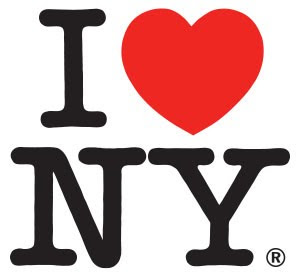
A bit of background - the IHeartNY logo was designed in 1977 by graphic designer Milton Glaser as part of what was originally a three month campaign to clean up New York City and boost tourism for the state as a whole. In an interview with Chip Kidd Glaser explains how
It was the mid-seventies, a terrible moment in the city. Morale was at the bottom of the pit…There was so much dog shit because people didn’t feel that they deserved anything else, right?...then suddenly the city simultaneously got fed up and said, “It’s our city, we’re going to take it back, we’re not going to allow this stuff to happen.” And part of that moment was this campaign.
The typeface used is American Typewriter and it’s possible Glaser’s use of the now iconic ‘Heart’ was inspired by an earlier 1969 tourist campaign ‘Virginia is for Lovers', which featured a similar red heart, although not integrated into the text.

IHeartNY has become such an enduring icon of popular culture arguably because Glaser unwittingly anticipated in his design so many things that would come to define contemporary postmodern/postdigital culture, including sites like Facebook and Twitter and ‘netspeak’ and the use of icons and abbreviations in communication.

Glaser’s IHeartNY is often described as belonging to the pop-art aesthetic and as such is arguably ‘modernist’ in design. It’s true in that the American Typewriter typeface utilises what was the ultimate in banal typography of the day as design. Similarly, the use of the heart icon from the ‘Virginia is for Lovers’ campaign could also be said to be drawing from and reflecting fragments of popular culture in a way that pop-artists such as Warhol did to a greater degree in works such as Campbell’s Soup or Marilyn.

However, while pop-artist like Warhol were highly distinctive in style, Glaser’s IHeartNY seems to resist any sense of ‘authorship’, as Glaser himself admits;
[IHeartNY] has an odd characteristic by now, that it doesn’t look like anybody designed it….It looks like a weird historical thing…Basically, you don’t have a concept, “Oh, this is something that was designed.” It just seems so…I guess, inevitable.
By avoiding a strong and distinctive personal style, the IHeartNY logo is also arguably postmodern. I recently stumbled across an essay I wrote in a previous life as an English Lit student on postmodernism and Shakespeare, and while the subject matter is obviously not wildly relevant here, there were a few quotations which might be useful, for example:
What replaces [the notion of ‘author’] in postmodernist culture and theory is not the absolute absence of style, but its detachment from the concept of the powerful originating author’ (Steven Connor, Postmodernist Culture, 198).
So, in a sense the IHeartNY logo actually embodies the postmodern qualities of ‘transience and anonymity’ ... as a result it's unsurprising that it has been adopted by contemporary postmodern culture, a culture defined to a degree by a loss of personal style - a generation modelled on pop-icons:
Another aspect of IHeartNY's appeal is down to the ultra-subjective outlook of the postdigital age. Since the onset of modernism in the late 1800s, society has become increasingly ego-centric; Pre-modernism, we generally believed what the church told us to believe and were therefore governed by a ‘God thinks…’ sensibility. Once modernism had set in and iconoclasts such as Darwin and Einstein became more prominent and credible, we began to question our own beliefs and became more subjective, grouping ourselves accordingly, eg, the art world exploded into what would become the Naturalists, Impressionists, Surrealists, etc. And so, culture became governed by a ‘We think…’ outlook. Finally we have the postmodern, postdigital age, where the Myspace-Facebook-Twitter generation can communicate to the world instantly and easily their opinions, beliefs, likes, dislikes. It is finally the generation of ‘I think…’, or perhaps, ‘I Heart…’
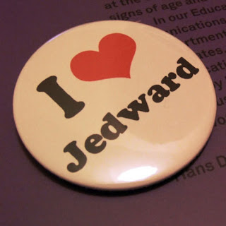
Linked to this subjectivity in contemporary culture is the effect the postdigital age has had on communication, ie, ‘netspeak’. The last 10 years or so has seen distillation of language into icons (eg, emoticons) and abbreviations, (think omg, wtf, lol, etc) and conflations (think SuBo, RPatz, Jedward, etc). As such, perhaps IHeartNY has endured as an icon because it because the Myspace-Facebook-Twitter generation have adopted it as their own - it addresses them on their own terms, employing their familiar tools of communication, ie, a subjective viewpoint, and the use of the icon and the acronym/abbreviation.

Finally, I believe that IHeartNY has endured because it was never meant to. As Glaser himself admits, it was only ever meant to be part of a 3 month campaign. Transience and obsolescence seem to lie at the heart of the logo; typewritten copy was everywhere when Glaser designed the logo - a time before wordprocessors has become commonplace and widespread. So, the use of American Typewriter created a sense that the logo was something that was just thrown out there, typed out and chucked together as quickly as possible as a disposable and transient expression. Again, it is relatively easy to draw comparisons between this sense of disposability in IHeartNY and the throwaway essence of posts on sites like Facebook or Twitter.

Yet while the logo does seem at home in the postdigital age, it's worth noting that the typeface does also root the logo firmly as a relic of a predigital age (the late 1970s and early 1980s saw the transition for most businesses between the typewriter and the wordprocessor). Almost as soon as the logo appeared in 1977 it was already becoming out of date.

In essence then, this relatively simple design is the site of a number of inherent contradictions; it is at once ‘modernist’ and ‘postmodernist’, adhering to certain pop art conventions on one hand, whilst resisting the notion of the modernist artist-author on the other; it is a relic in one sense, an archive of a now obsolete typeface and a re-appropriated icon from a 1969 tourist campaign, yet it is also quintessentially contemporary, at home among the netspeak of the social networking sites so synonymous with pop-culture.
Perhaps it is these tensions which have allowed IHeartNY to endure as a pop-icon – In his text 'Of Other Spaces' Michel Foucault explored the concept of the heterotopia, an idea of postmodern space which he described as
The will to enclose in one place all times, all epochs, all forms, all tastes, the idea of constituting a place of all times that is itself outside of time and inaccessible to its ravages…
Of Other Spaces, 26
While IHeartNY perhaps does not enclose 'all times, all epochs, all forms', etc, it is a site of various conradictions, which has, for one reason or another become a kind of place 'that is itself outside of time and inaccessible to its ravages...'


There are obviously a number other issues that could be explored in relation to IHeartNY, including the ironic reappropriations of the design, the development of the verb 'I Heart...' as a result of the logo or the idea of NYC as a luxury brand which people wish to buy into. However, one random fact I came across which struck me was the fact that in 2008 New York City spent nearly $1m on typewriters, mostly for use by New York Police Department...I thought it was an interesting fact to throw into the mix...

Wednesday 4 November 2009

The Identity Project

The poster for exhibition The Identity Project caught my eye on the tube today, and intrigued me enough to check the website out. The exhibition will explore what makes us unique and what shapes our personalities and beliefs; It has a really striking, bold, simple visual identity composed of a brown paper background, brown labels & string, and a bold black stencil typeface and silhouettes. Such a pared-down look is clearly a nod towards wartime evacuation labels, thereby immediately raising the question of who we are and what makes us 'us'. A really successful and striking campaign...might even check out the exhibition!

InDesign Session (Part 1)

Really useful InDesign session with Jo yesterday. I’ve been using InDesign for a couple of years now, so am fairly comfortable using it, but nonetheless picked up some really useful tools and shortcuts which I think will really improve the way I use the software, including:
  • Swatches > Load Swatches - to load a swatch palette from another document you’re working on
  • Edit > Step & Repeat (great tool!)
  • Type > Create Outlines – really easy to bring over into InDesign the stuff we’ve being doing with Jo in Illustrator in terms of editing type. A simple but successful way of putting your own stamp onto a project.
  • To retain an acceptable resolution when enlarging images, try not to take them above 130% (ideally 100% or less)
  • If you embed an image into your InDesign document (Links > Embed file), you overcome problems associated with broken links but obviously lose the ‘update link’ option and greatly increase the file size.
  • If you have placed an image into your InDesign document and can’t remember its original file location you can save it to a new location through InDesign by going to Links > Copy link(s) to...
In addition, a few tips I picked up in the all-day pdf workshop last Friday include:
  • Make sure pdfs are compatible with Acrobat 5 or later
  • To add a hyperlink to an Indesign doc: Window > Interactive > Create new hyperlink
  • To add a video to a pdf (in Acrobat):
  1. File > Create pdf > From file > Navigate to file
  2. Tools > Advanced editing > Movie tool
  3. File > Export/Save
(To delete a movie – Tools > Advanced editing > Select object tool)

Favela Chic!

I saw this sign for restaurant/bar/exhibition space Favela Chic in Shoreditch the other day and completely fell in love with it! If my GCSE Geography serves me correctly, the favelas are Brazilian shanty towns that exist on the periphery, growing randomly, almost organically from found elements. As such, I guess the design concept for this bar is about bringing together a sense of Brazilian/Latin flair and a kind of retro patchwork aesthetic. I love how the sign itself looks like it was constructed from ‘found’ elements; letters reappropriated from other signs, and urban debris. It looks like a pretty intriguing place...according to their Design Manifesto (only visible on their French sister site - translated here if you don't speak French...!), 'the world of Favela presents itself as a joyous bric-a-brac where each object becomes a symbol reused. The assembly of various materials, juxtaposed and pasted is the geometry of urban chaos.' Such a poetic impetus behind design - awesome! (I might steal it to describe my collages...!). I Heart Favela Chic!

Friday 23 October 2009

J'aime Collage!

I'm loving the collage task - my plan so far has been to collect any images which jump out at me and then have a mammoth arranging/sticking session at some point in the near future. I'm thinking the collages will be most interesting if the images come from a range of sources, so I've been procuring images from; the free papers and magazines on the tube; some second-hand books, which cost me the princely sum of £2.30, including Diana for Girls - 1965 and Understanding Antiques; and some questionable magazines/flyers from bars in and around Soho... Unfortunately I now can't look through any printed material without first scanning the page for interesting images or text...

One of the reasons I'm really enjoying the task is because I applied for the FdA was because I knew there were probably ways to unlock creativity but didn't know how to go about it...Cue collage - by creating the collages almost automatically it opens up a whole load of possibilities and avenues which I know I would never have gone down had I approached the whole thing 'intellectually', overthinking each decision.

Here's my kitchen table is it stands at the moment......now I just need to source some A6 cards...