Right - Having settled on a topic for my book, that is, how men and women respond to the nude male, I started experimenting with laying out the images and copy. I realised that as I had such a wide variety of images in terms of contrast, brightness, colour, etc, I needed to bring a degree of cohesion and consistency to the book, and so converted all the to greyscale, which was quite successful at drawing all the photos together visually.
Originally I started taking random extracts from the essay and laying them over images, but found without the driving force of the rest of essay, the book lacked progression and intention.
As a result I decided the book should actually be more like an illustrated form of the essay itself. This helped with the initial population of the InDesign template and the laying out of images and text, but after showing the work in progress to my group in the fourth session realised the layout of the book lacked imagination, dynamism and, most importantly, creativity.
After looking at the work of some of my peers I deduced that the more successful book designs were the ones which were visually varied and included spreads interspersed into the document which included quotes, facts, etc, ie, small accessible nuggets of info which gave the reader a route into the subject matter.
I used the session to start planning some more creative, unusual layouts to use in the book design, which would add variety and interest to the design:
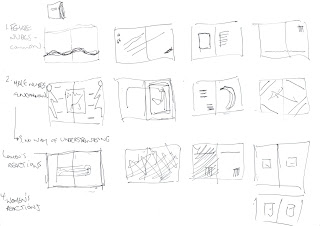
I agreed with Steve that the design as it was, was very text-heavy, not particularly approachable, and that the design itself needed to be more fun, and so left the session wanting to explore/develop the following:
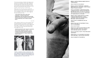
- Quotes about the naked male and the penis
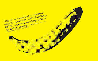
- Visual euphemisms for the penis, such as bananas, cucumbers, etc.
- A distillation of the copy so the book as a whole continued to flow and progress, but more concisely, so it would be more accessible.
- More creative layouts – formatting type on angles, experimenting with colour, etc.
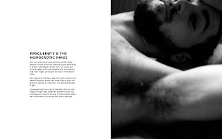
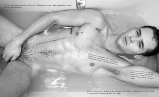
- Separation of provocative images from the analyses of various reactions, so readers are not distracted from the copy by the shocking content of the images, and so they are able to scrutinise their reaction to the naked male more clearly.
The more I worked on the design of the book, the more I realised the design needed to capture and express more completely what the book was all about, that is, primarily:
1. How we “read” images of the nude
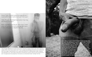
Whilst experimenting with formatting text at angles to create interest, I realised that one simple way to capture the subject of how we “read” nudes was to set copy directly over images of the naked body, thus literally forcing the viewer to “read” the naked body:

2. How men and women construct their gender identities through viewing.
I experimented with typography and colour to convey the social constructs at play in reactions to nude images, playing with heavy, solid, “superhero” typefaces in blue for male voices and elegant calligraphic typefaces in pink for the female voices. Further, I decided to set the analyses of each comment at right angles to the quotes themselves, such that they could be read or skimmed over by the reader as desired:
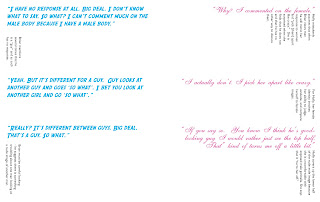
While more visually interesting and intriguing, the range of typefaces compromised the consistency and cohesiveness of the book as a whole, and so ultimately I opted to convey the gendered voices solely through colour and male and female ‘toilet door’ symbols…

3. The lack of vocabulary/script to discuss the male nude.
One of the things that struck me as ironic whilst developing the book was that as a culture we have so many euphemisms for the penis and yet, as the essay illustrates, we have such difficulty discussing and the naked male form. As such, I made the decision to include an ‘A-Z’ of penis euphemisms running along the bottom margin of each spread throughout the whole book. Whilst this primarily served as a means of lightening the tone of the book, and adding a sense consistency throughout the design, it also partly served to highlight this contradiction between the plethora of words we have for ‘penis’ and our inability to vocalise our reaction to it…
Overall, I am really pleased with the final book, although in hindsight perhaps should have set aside more time to designing the book cover as I feel at present it is the least successful aspect of the design. Having said that, I think the visual puns (banana, cucumber, etc) and quotes used within the book are particularly successful at making the content approachable and engaging.

Having seen the book in printed form I've realised there are some elements which aren't quite in their optimum position on the page, for example some copy disappears into the gutter a little, and a couple of full-spread, full bleed images which lost their impact as again, some of the visual information disappeared into the gutter. As such, time permitting, I'm planning to tweak these aspects and have the book reprinted in time for the summative assessment, and also for use in my portfolio...
All in all, a really interesting and useful assignment.
[The whole book can be viewed online at
http://issuu.com/maxwolf/docs/finalbookmw]


