Wednesday, 26 May 2010

LondonPARK


During our initial stint in the park we carried out a number of the IDEO observation techniques, including Narration, Fly on the Wall and Shadowing to identify some of the potential problems users may have with the wayfinding system in the Park.


Although we did identify slight problems with navigation and the position of signposts across the park, on reflection I decided the navigational systems were adequate and perhaps didn't merit a rethink. As such, I went for a second visit to carry out more research and this time I came away with what I thought may be more useful observations which included:


> Joggers used the park in a very direct way, often jogging alone along the same paths around the perimeter of the park, usually listening to an ipod.


> Recreational users were seldom alone, and often used the park to socialise in groups for eg, picnics, sports.


I then carried out a concept challenge on both my observations and the park in general, which generated some interesting ideas, eg:


> Speed-dating picnic


> Michelin Star picnic


> Random jogging, ie, some sort of system which could generate new, random jogging routes for joggers. For me this had the most potential, not least because variation helps to keep runners motivated and minimises the risk of boredom stopping play. So I developed this idea into a kind of 'jogger's satnav' app; an app for the iphone which would create new random routes for joggers.


I investigated current iphone apps for joggers and discovered that the majority of jogger's apps currently only store routes retrospectively and don't generate new routes, or act as a guide in any way.


Eventually I formalised an app which would create a running route based on the desired starting and end points, (plus any points the user would like to include along the route) and the desired duration/distance of run. The app would then guide the user along the route via a number of different options, eg, audio directions, vibrating wristbands to alert turning points, etc. I also devised a number of different audio modes, from simply music and jogging playlists, to a 'points of interest' feature which would give a brief history of the various features/landmarks along the route, to simply a news option which could stream live news updates to the user as they run.


For my book I now need to create some photoshopped mockup screenshots of how my app will operate, as per the below...


STENCILondon


During the stencil workshop I created a vernacular typeface which features the spires of the Houses of Parliament and Big Ben. I used as my starting point the typeface Braggadoccio, because its simple block form made it relatively easy to convert into a stencil over the course of the workshop. The stencil graphic was relatively successful at capturing a sense of London's skyline, and I experimented with different print finishes.


It was also noted by chance that when the graphic is turned upside-down, it has the appearance of dripping blood. This set me thinking about creating a London 'ambigram', that is a word that can be read from two different viewpoints; as such I wanted to create a typographic visual that, when read from one angle, would reference London's grandiose, lofty architecture, and when flipped would reference London's bloody past.


I experimented with how the form of a London ambigram might work, before eventually resorting to an 'ambigram generator' website for reasons of speed and convenience, to create the type to use as my starting point.


Once I had this graphic, I annexed the spires of a number of London churches...


before tracing and digitising…


For the final outcome in my book I'd like to design a poster in the style of the recent marmite campaign which changes depending on the orientation of the poster...


So, from one aspect the poster could reference London's lofty architecture, from another the gruesome history behind the buildings...

ICONLondon


In preparation for the icon workshop I walked at evening rush-hour from the relatively affluent area of Bond St, through the popular commercial areas around Regent St and Oxford St, via the cobbled alleys around Carnaby St, through to the seedy backalleys of Soho. I made a note of the prevailing feelings and impressions of each area, along with the frequently used icons and typefaces. I then repeated the journey later in the evening an noted how the feel of the respective areas had changed.


In the workshop we used these impressions and experiences to produce a number of icons which captured the essence of the various of London, which we could use to create a flag for the capital which was a manifestation of our own experiences and feelings.


Ultimately the icons we created as a group I felt were too literal in their interpretation, and so after the workshop I revisited the activity, and attempted to inject some of my own experiences into the graphics. To begin with I focussed on the 3 contrasting areas of Bond St, Oxford St and Carnaby St. I began by collating and analysing the various logos which make up the visual landscape of these areas, and then used these observations to start forming the icons:


The logos and graphics of Bond St are unsurprising uniform in their look and feel, employing a colour scheme of black, white and gold (to a lesser extent) and using either classic, serifs, clean, modern geometric sans-serifs or a combination of the two. In developing this icon, I took into account the imposing, intimidating feeling of the area, as well as it's traditional, conservative roots. The form of the icon developed into a solid black polygon whose shape was Inspired by the angular forms of the Rolls Royces on Berkeley Square, plus castle and flag details which added a sense of both heritage and exclusivity. Further, the nearby saville row provided the inspiration for the stitching which is a nod towards the bespoke experience expected in the area.


For Oxford St I noted that the majority of logos on view used primary colours and simple geometric shapes such as squares, circles and triangles, and used simple, often lowercase, Helvetica-esq sans-serifs. By hanging the icon from a clothes hanger I created a visual nod towards the 'off-the-rack', mass-produced nature of the business in the area, however, i quickly realised at some point I need to capture the frustration caused by crowds and tourists in the area...


For Carnaby St, it became apparent that the visuals were more diverse and crafted, and showed much greater awareness of and attention to typography and colour. Thus I began by experimenting with more specialised typefaces, as well as an irregular polygon shape, which reflects the non-conformist impulse which prevails in the area.


In the spirit of the initial workshop I hit upon the idea of using the icons to create a flag for the West End, but decided that in this case it would be appropriate to include an icon for Soho, and so yesterday went on another research trip, observing the dominant visuals and feelings in the area:


Findings include:


A predominance of Italian restaurants and cafes and therefore Roman names and Classic Roman serifs and cursive sans-serifs:


High density of gay bars - rainbow colour schemes and graphics of naked male torsos


Strip clubs/brothels/sex shops - neon red lights:


Pubs! Traditional pub signage/iconography


Now I just need to work up each icon in order to put the flag together...


CONTRASTLondon


For the contrast workshop we produced a concertina booklet with alternating patterns of black and white, created from found images around the University.

To develop this I decided to broaden my interpretation of 'contrast' and have decided to create a book(let) aimed at children that explores the whole colour spectrum, using London street names for my inspiration, taken straight from the index of a London A-Z.


My final selection of colours/streets are:

  • Black Swan Yard
  • Blue Lion Place
  • Green Dragon Court
  • Red Castle Close
  • White Bear Yard
  • Orange Tree Court
  • Golden Hind Place
The obvious gap between the technicolor, illustrated, fantasy world of this book and the real places signified by the streetnames will also add another layer to the concept of 'contrast'...


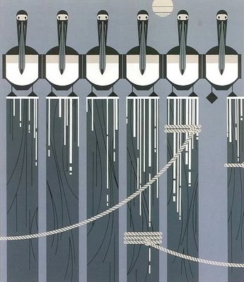
I have taken inspiration from the illustrative styles of modernist artist Charley Harper and illustrator Jenzo Terado and have begun by attempting to emulate their bold, geometric forms to realise each different colour:


The next stage is to begin collaging each form, using some of the patterns developed from the LondonPATTERN and CAMOUFLAGELondon workshops...


MONOPRINTLondon


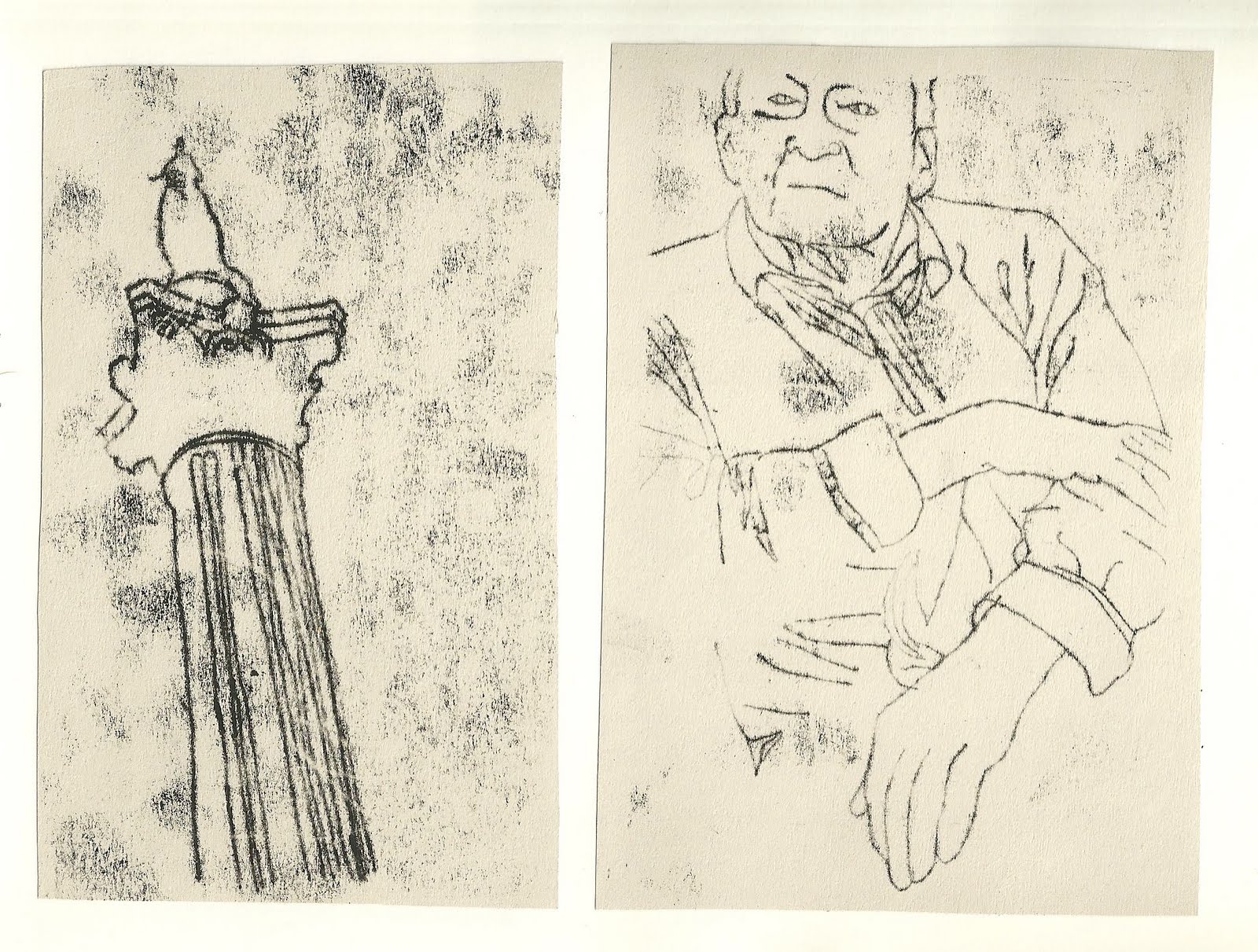
In my first workshop I began experimenting with the possibilities and limitations of the relatively simple medium of monoprint. It became apparent that line drawings created the most successful prints, and that the resultant prints had a raw, grimy quality.


After the workshop I researched other artists who use monoprint, and was most interested by some of Tracey Emin's monoprints.


Emin exploits the honest and gritty voice of the medium to speak frankly directly to the viewer, often with intention of shocking and unsettling.


The idea of monoprint as an inherently honest and direct medium really appealed to me, and so I decided to explore how I could use the process to represent some of the less positive/glossy aspects of London. Inspired by B&W Studio's Annual Report for St George's Crypt, which features stark, direct photographic portraits of homeless people to connect viewer with subject, I decided to take homelessness in London as my focus.


Yesterday I set about travelling around London interviewing a number of homeless people, taking photographic portraits and recording their personal stories of how they ended up on the streets of London.


I will use these photos as the basis for my monoprints, and although I've begun experimenting transforming the photos into line drawings, as yet I haven't begun printing the final portraits or worked out if/how I will incorporate their stories into the prints...


Major Project...The Story So Far...

So, (as half-predicted), I haven't been too good at keeping my blog up-to-date since the major project began, so what follows will be a bit of an overview of each workshop and the development work I've done up to this point...Enjoy!

Saturday, 24 April 2010

La Vie En Rouge!

So I've decided to use the collage extension project as an opportunity to explore the possibilities and limitations of linocut printing, which I've wanted to explore linocuts since I first came across the work of Art Spiegelman around four years ago...


Back in 2006 I was asked to design set, costume and publicity for "The Wild Party", a jazz musical based on a 1928 poem by Joseph Moncure March about the hedonistic debauchery and excess of the rouring twenties...


I got my hands on a copy of the original poem, primarily for research, and instantly fell in love with Spiegelman's linocut illustrations (added later in 1994) - perfectly dark, raw and stark with an almost tactile quality to them.


I decided to begin relatively simply, with one of my collages which I wasn't too intricate, but would perhaps work well in a bold linocut style; 'La Vie En Rouge'...


Having missed the opportunity to make it along to a linocut printing workshop in the print studio last term, I set about teaching myself the process, beginning by transferring the design onto a small A5 test-piece of lino, and then starting the cutting process...


As I expected, the cutting of the linoblock is time-consuming and at times, painful (it took me a few cut fingers to remember to keep my spare hand out of the way of the lino-cutter), but an interesting and satisfying process...My first prints were quick and rough, but useful, and confirmed that to get the level of detail and finish I wanted, I'd have to work on a larger scale...


That said, given the time-consuming nature of the process, I decided to compromise and work on an A3 block...


Having eventually completed the A3 linocut I set about experimenting with different print finishes, from well-inked block colours, to dry-ink textured finishes...


Ideally I would have liked to experimented further with reduction linocutting to add a second colour and extra level of detail, however working full time during the holiday and an impending VCT essay convinced me I'd have to make do with a single colour print...

In the spirit of the original collage, however, I did experiment with paper and ink to find the right manifestation of red... Ultimately, I opted for a stark, bold black on an all-consuming vibrant crimson most successully captured the title/caption of the piece and embraced the dark quality of the linocut...


All in all I'm happy with the quality of the final prints in that the lines are clean and the prints well-inked, although I think the design itself lacks punch and impact. Perhaps this could have been improved with the addition of a second colour through a reduction linocut, however in hindsight I don't think the original design fully embraces the dark, sinister and raw potential of the medium... If I were to embark on another linocut project I think I'd choose a subject matter with a little more edge and a design with a little more roughness and detail...

As an exploration into the possibilities and limitations of the medium though, definitely a useful process, and almost certainly one I'd like to explore further (when time permits!)...

Vive La Vie En Rouge!